
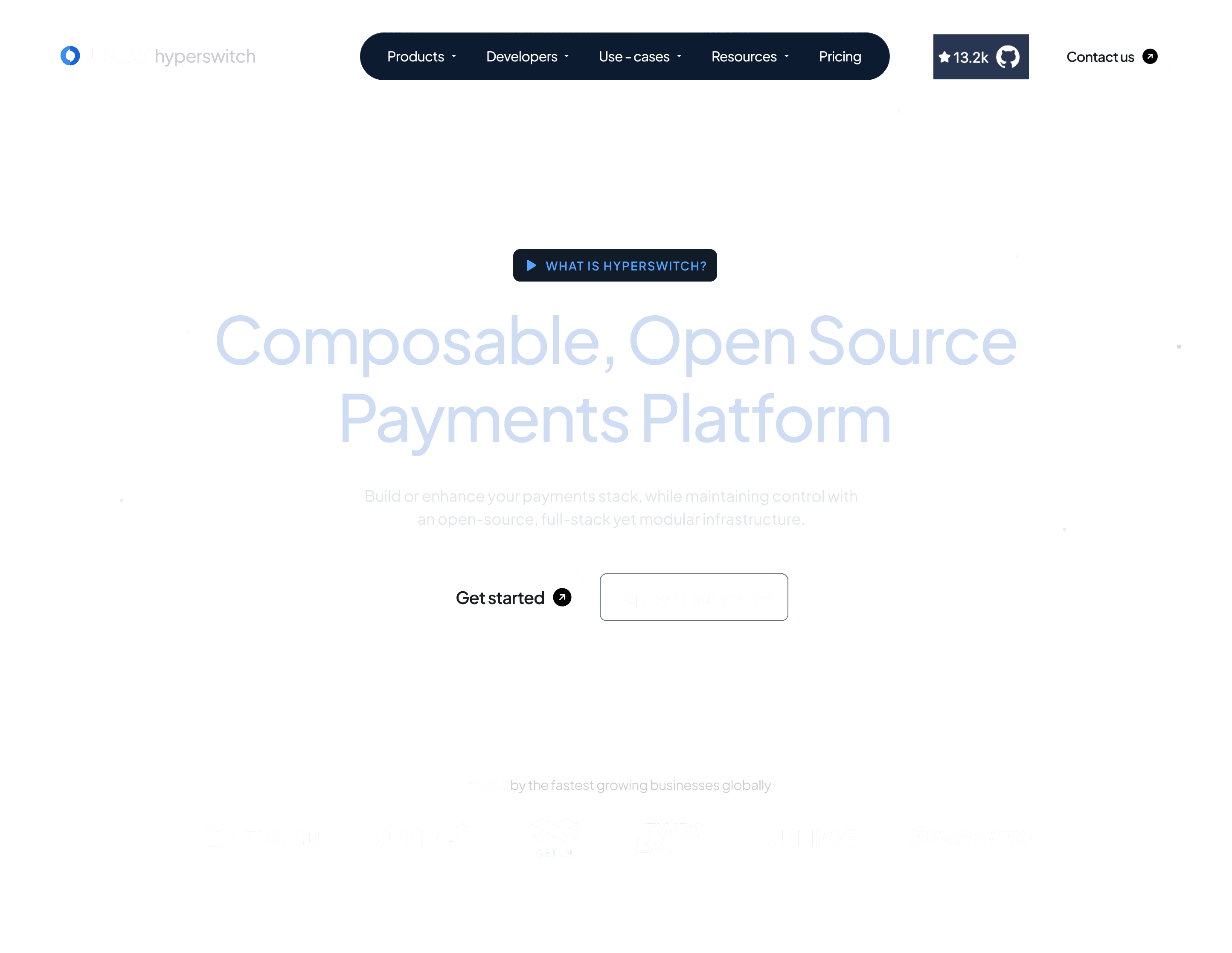
Hyperswitch Homepage Design
Re-branding Hyperswitch to an Open-source, Composable, and Modular Payments Platform.
Role: Visual Designer
Scope: Web Design, Re-brand, Visual Design
Collaborators: Sarthak Tiwari (Visual Designer), Sarthak Singh (PMM), Goutham P (Motion Designer), Prathmesh Vhatkar and Sumeet Debnath (Developers)


What This Project Solved
Hyperswitch is a powerful open-source payments platform, but its previous web presence didn’t reflect that.
It felt:
Slightly playful
Not developer-first
Lacking technical depth in perception
The goal was to realign the experience with what Hyperswitch actually is:
An open, composable, modular, developer-first payments system.

Core Challenge
The challenge wasn’t just visual, it was about:
Shifting perception
Making architecture understandable
Designing for developers, not just decision-makers

Objectives & Goals
Reposition Hyperswitch as open-source and developer-centric
Communicate modularity and composability clearly
Move away from a playful tone to a more technical, system-driven identity
Make complex payment infrastructure feel navigable and structured
Build a visual language that scales with the product
Why a New Visual Direction Was Needed
The earlier direction wasn’t wrong, but it wasn’t aligned.
It:
Felt lighter than the product’s depth
Didn’t reflect developer workflows
Missed the idea of control, flexibility, and system design
For an open-source product, perception matters.
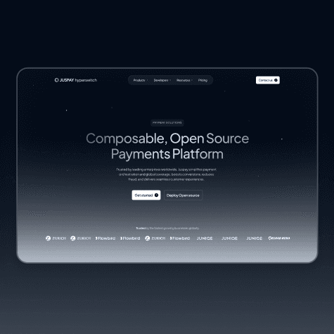
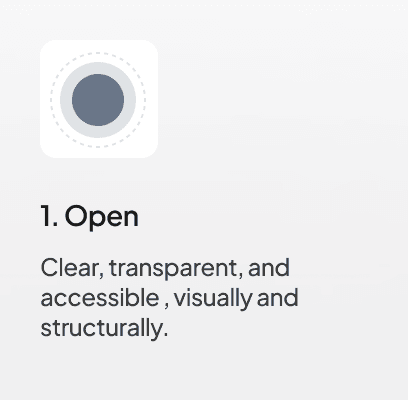
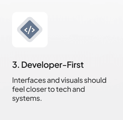
The New Visual Philosophy
The redesign focused on three core ideas:
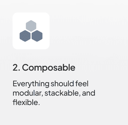
Visual System: Modularity Through Form

Cubes became the core building block of the system.
Because they:
Represent the smallest understandable unit
Can be stacked, combined, and extended
Naturally communicate modularity
Feel structured and predictable
Are easy to interpret across cultures and contexts
They allowed us to visually express:
“Build your own stack”
“Assemble what you need”
Instead of showing complexity, we showed how complexity is constructed.
Illustrations
A lightweight illustration style was developed to support the system.
Built using modular components (primarily cubes)
Minimal, functional, and system-driven
Used to explain flows, infrastructure, and relationships
Avoided decorative or abstract storytelling
Homepage Design
The redesign shifts from a feature led presentation to a system-led narrative.
Instead of explaining the product through features or UI, the goal was to make the system understandable through structure, hierarchy, and visual logic.
Structure over decoration
Systems over screens
Components over pages
Every decision was guided by one question:
Does this help someone understand how the system works?

View the live website here with interactions and motion:
Other Projects


View more


