
Iconset for Juspay India
Product icon system for Juspay India website
Role: Visual Designer
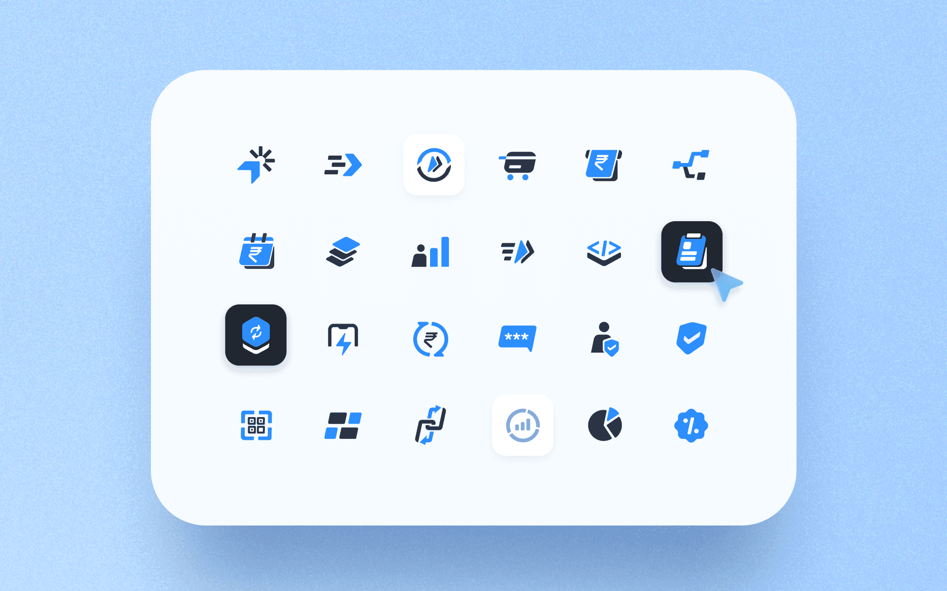
Scope: 25+ product and feature icons, light and dark variants, product badges
Project Intent
Create a distinct icon identity for Juspay India's product suite that communicates what each product does at a glance, while feeling cohesive as a family. Since this sat outside Juspay's strict system icon guidelines, there was room to be more expressive, metaphorical, and brand-forward.
Process
Intent: Ground every icon in the product's core function.
Each icon started with understanding the product: what it solves, how it helps, what it feels like to use. HyperCheckout enables fast one-click payments, so the icon became a cursor with radiating lines, symbolising both the click action and the orchestration running behind it. This product-first thinking applied across the full set.
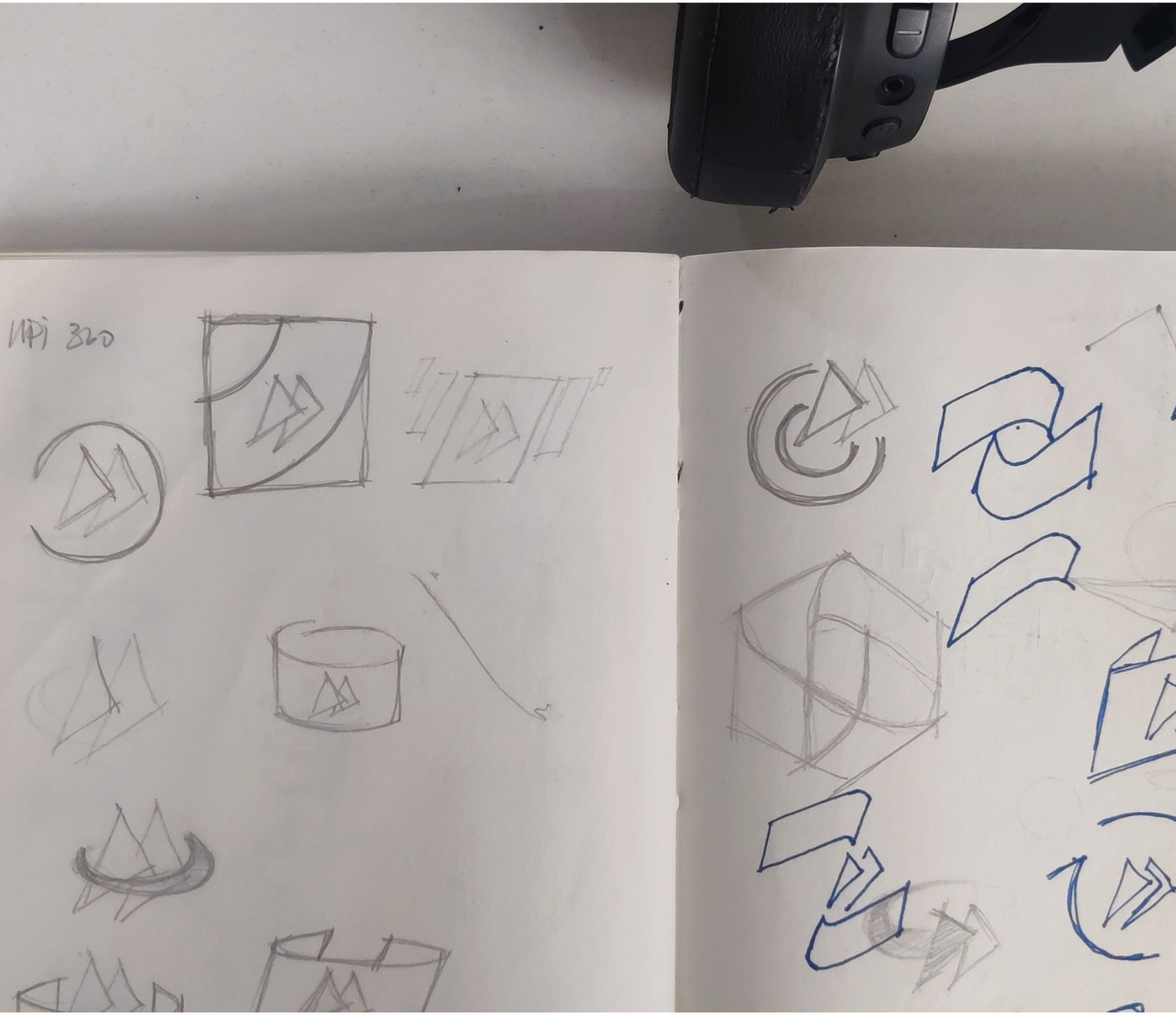
Sketching on paper came first to catch ideas quickly. Rough, messy drawings were enough to lock a direction before moving to Figma for refinement and iteration through feedback rounds.
Visual Language
Intent: Feel fast, precise, and distinctly Juspay.
The icons follow a duotone system: Juspay blue (#3B82F6) paired with near-black (#1A1A2E). Blue carries the active, functional element of each icon, the part that represents what the product does (a routing arrow, a payment symbol, a refresh cycle). Black anchors the structural form, the object or container that gives context (a card, a calendar, a shield). This split lets the eye instantly parse action from object, even at small sizes.
The forms lean toward geometric reduction over literal representation. Rather than drawing a full checkout screen, the icon distils it into a cursor and radiating lines. This abstraction keeps the icons versatile across sizes and contexts while leaving room for interpretation. Shapes are compact and centred, with consistent internal proportions so the set reads as a family even when individual metaphors differ widely.
The duotone palette also enables clean light/dark mode adaptability. On light backgrounds, the full blue-and-black pairing reads at full contrast. On dark backgrounds, the same icon inverts (blue stays, black becomes white) without needing a redraw or alternate asset. A monotone version of each icon also exists for contexts where the duotone treatment is too heavy, like dense UI lists, disabled states, or third-party surfaces where brand colour isn't appropriate. The monotone variant collapses both tones into a single fill, proving the forms are strong enough to hold up without colour doing the work.
Grid & Construction
Intent: Keep forms consistent without making them rigid.
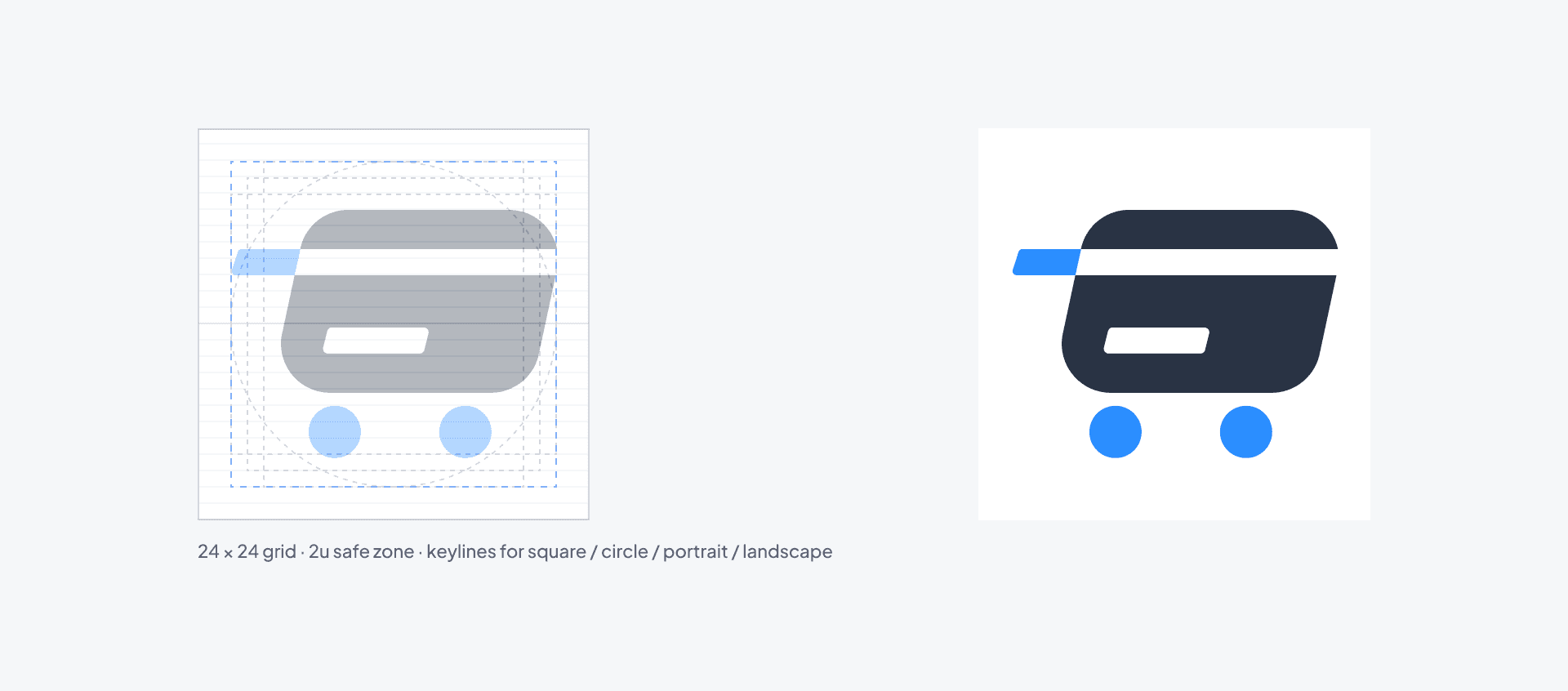
All icons are built on a 24x24 base grid with a 2px safe zone. Stroke weights are standardised at 2px for primary strokes. The grid ensures optical alignment across the set even though individual forms vary widely (from abstract routing symbols to literal rupee signs).
Because the icons are tilted at 12°, uniform corner radii look unbalanced after rotation. Each corner had to be adjusted manually so that they feel optically even. A 4px radius on a top-left corner reads differently than 4px on a bottom-right when the whole shape is angled. This is one of those invisible details that nobody notices when it's done right, but immediately feels off when it isn't.
The Tilt

Intent: Inject motion and energy into static marks.
Most icons sit at a 12° diagonal rather than perfectly upright. The angle is intentional on two levels: visually, it suggests speed and forward momentum, reflecting how Juspay products work. Symbolically, the 12° marks Juspay's 12 years, embedding the company's history into the design language itself. The tilt is subtle enough to feel natural but noticeable enough to give the set personality.
Variants & Application

Intent: Work everywhere the product name appears.
Each icon exists as a standalone mark for use in navigation dropdowns, feature grids, and marketing materials. The product badge variants appear in the website navbar's mega-menu, where each product listing pairs the icon with its name and a short description. The two-tone colour system inverts cleanly for dark backgrounds without needing a separate icon redraw.
Reflection
Looking back, there are things I would refine: tighter optical consistency across the set, more rigorous stress-testing at very small sizes, and a few metaphors that could be pushed further. But this project was a strong warm-up that built my confidence in thinking through icon systems end-to-end, from product understanding to final delivery in multiple contexts.
Other Projects


View more


