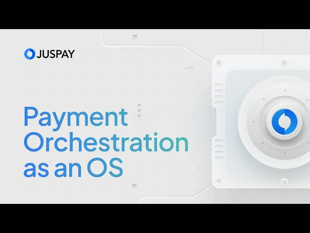

Payment Orchestration as an OS
Visual frames designed for a product video explaining how Juspay's payment orchestration platform works as a full operating system, not just a routing layer.
Role: Visual Designer
Scope: Visual Storytelling, Visual Frames, UI
CONTEXT
Juspay's payment orchestration has grown well past just routing payments when a processor goes down. It now covers checkout, offers, tokenisation, authentication, routing, reconciliation, analytics, experimentation. The video needed to communicate that shift: this isn't a fallback tool, it's an OS for your entire payments stack. My job was to design the visual frames that the motion team would later animate.
This was also one of the first major video collaterals after the Juspay rebrand. So the frames had to prove the new brand system works beyond static pages and decks. Colours, type, layout language, all of it had to translate into motion without losing what made the rebrand feel like Juspay.
THE CORE IDEA
Show breadth without making it feel like a feature list.
The video walks through seven layers of the platform: checkout, offers, tokenisation + auth, routing, post-transaction ops, analytics, and the full picture. That's a lot of ground for a ~4 minute video. The challenge was keeping each section visually distinct while making the whole thing feel like one coherent system. Not seven separate pitches stitched together.

THE VISUAL APPROACH
Rebrand in motion.
The frames use the Juspay rebrand system directly. This video was a test of whether the new brand language could hold up in motion, not just on a website or a pitch deck. Type hierarchy, colour palette, spacing, illustration style, all carried over from the rebrand guidelines.
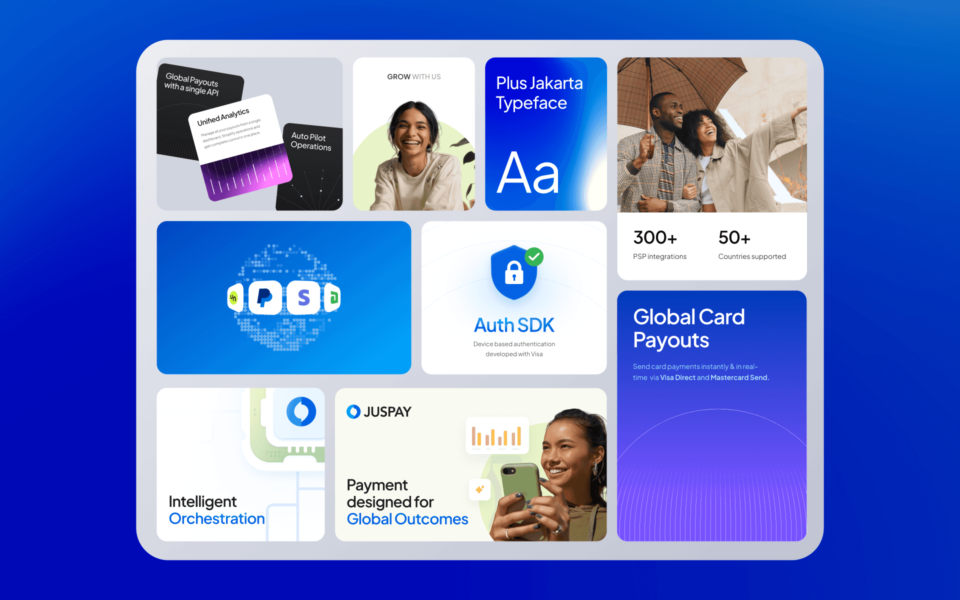
For the product sections, I leaned on simplified UI representations rather than abstract graphics. If the section is about routing, the frame shows something that looks like a routing interface. If it's about checkout, you see a checkout. Kept abstraction low so viewers could connect what they're hearing to what they're seeing without extra mental work.
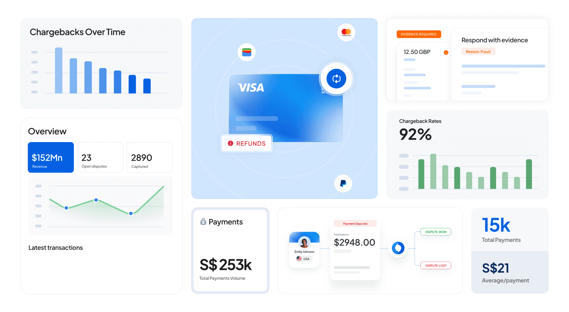
The routing section was the hardest to visualise. Routing logic is inherently invisible, it's rules and conditions, not a UI someone clicks through. I used layered dimensional visuals (currency, issuer, location stacked as filterable axes) to make the logic spatial and scannable.

DESIGNING FOR MOTION
Frames that are built to move.
Every frame was composed knowing it would be animated. That meant:
Layered elements : Objects on separate layers so the motion team could animate entries, exits, and transitions without cutting things apart.

Clear focal hierarchy: One hero element per frame, supporting elements secondary. Guides the viewer's eye and gives the motion designer a natural animation sequence.

Transition-aware composition: Frames designed in pairs. The end state of one section sets up the entry of the next. Continuity across cuts.

Breathing room: Generous spacing so animated elements have somewhere to move into. Tight compositions look static even when animated.

A long video with a lot of product ground to cover. The job was making it feel like one story, not a feature catalogue. The rebrand holding up in motion was the secondary win.
Watch the full video here:
Other Projects


View more


